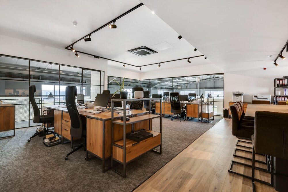
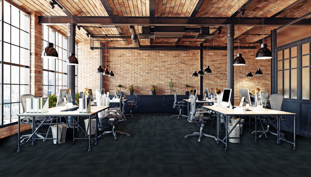
Explore how to choose the right carpet tile colour for your space. From versatile grey carpet tiles to bold tones, create the perfect look and feel.
INTRODUCTION
When it comes to designing a commercial or educational space, one of the most overlooked yet crucial elements is flooring. The right carpet tile colour can transform the atmosphere of a room, influence how people feel in the space, and even affect functionality and maintenance. Among the most popular options on the market are grey carpet tiles, which offer a timeless, versatile base that works in almost any environment.
But while grey carpet tiles remain a strong contender, there are many other shades and tones to consider depending on the type of project you are working on. Whether you’re designing an office, school, healthcare facility, or hospitality space, the colour of your carpet tiles can make a huge difference to both aesthetics and practicality.
In this blog, we’ll explore the factors to keep in mind when choosing carpet tile colours, the unique advantages of different shades (including grey carpet tiles, blues, greens, neutrals, and bold tones), and provide some insights into Lifespace Flooring ranges that can support your project.
Why colour matters in carpet tile selection
Flooring is not just about what’s underfoot; it’s a foundational design element. It sets the tone for the entire space, interacts with lighting, complements furniture, and even plays a role in employee productivity or student focus.
Here are a few reasons why colour selection is so important:
- Psychological impact – Colours influence mood. Warm tones can energise, while cool tones often calm.
- Perception of space – Light carpet tiles can make a small space feel larger, whereas dark tones can make a large room feel more intimate.
- Practical considerations – Certain shades such as grey carpet tiles, or darker shades show less dirt or wear, making them better for high-traffic environments.
- Brand alignment – Flooring colours can reflect your company’s identity or align with institutional branding.
With these in mind, let’s look at how different colour choices—including grey carpet tiles—work in various settings.
Grey carpet tiles: timeless and versatile
If there is one shade that has become a staple in commercial interiors, it’s grey. Grey carpet tiles provide a perfect balance between neutrality and modern style. They pair well with almost any design scheme, allowing flexibility as furniture, wall colours, or branding elements change and evolve.
Benefits of grey carpet tiles:
- Neutral foundation – Works with both bold accent walls and minimalist palettes.
- Practicality – Mid-tone greys hide dirt, stains, and wear better than very light or very dark options.
- Flexibility – Can be paired with coloured carpet tiles for zoning or pattern effects.
- Modern appeal – Grey has a contemporary, professional feel that suits offices, schools, and healthcare facilities alike.
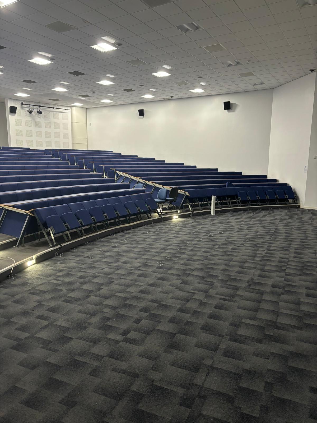
For example, the Lifespace Flooring Modern Edge range in Navy Nightfall with grey accents creates a sleek, polished look perfect for professional workspaces. Pairing grey carpet tiles with brighter modular tiles can create functional zoning in open-plan offices or classrooms.
Other colour options to consider
While grey carpet tiles are a safe and versatile choice, there are many other colour directions to explore depending on your project’s goals.
1. Blue carpet tiles – calm and focused
Blue is often associated with trust, focus, and calmness. Blue carpet tiles are excellent for offices where concentration is key or in healthcare spaces where a sense of calm is important.
- Benefits: Creates a professional, trustworthy environment; helps reduce stress; works well in educational settings.
- Where to use: Corporate boardrooms, classrooms, healthcare waiting areas.
- Example Range: A great example of blue carpet tiles would be the Lifespace Venetian Charm range in the shade Midnight Indigo. This dark blue design ensures dirt, stains, and wear are considered but also gives a bold aesthetic design to your space. Check out how this has been achieved in Kelmore HQ below, and read more about the blog on that project here:

2. Green carpet tiles – refreshing and natural
Green is connected with nature and renewal. Green carpet tiles bring a sense of freshness and balance, making them ideal for wellness centres or breakout areas.
- Benefits: Promotes creativity and relaxation; biophilic design appeal; works well with natural materials like wood or stone.
- Where to use: Student lounges, wellness rooms, libraries.
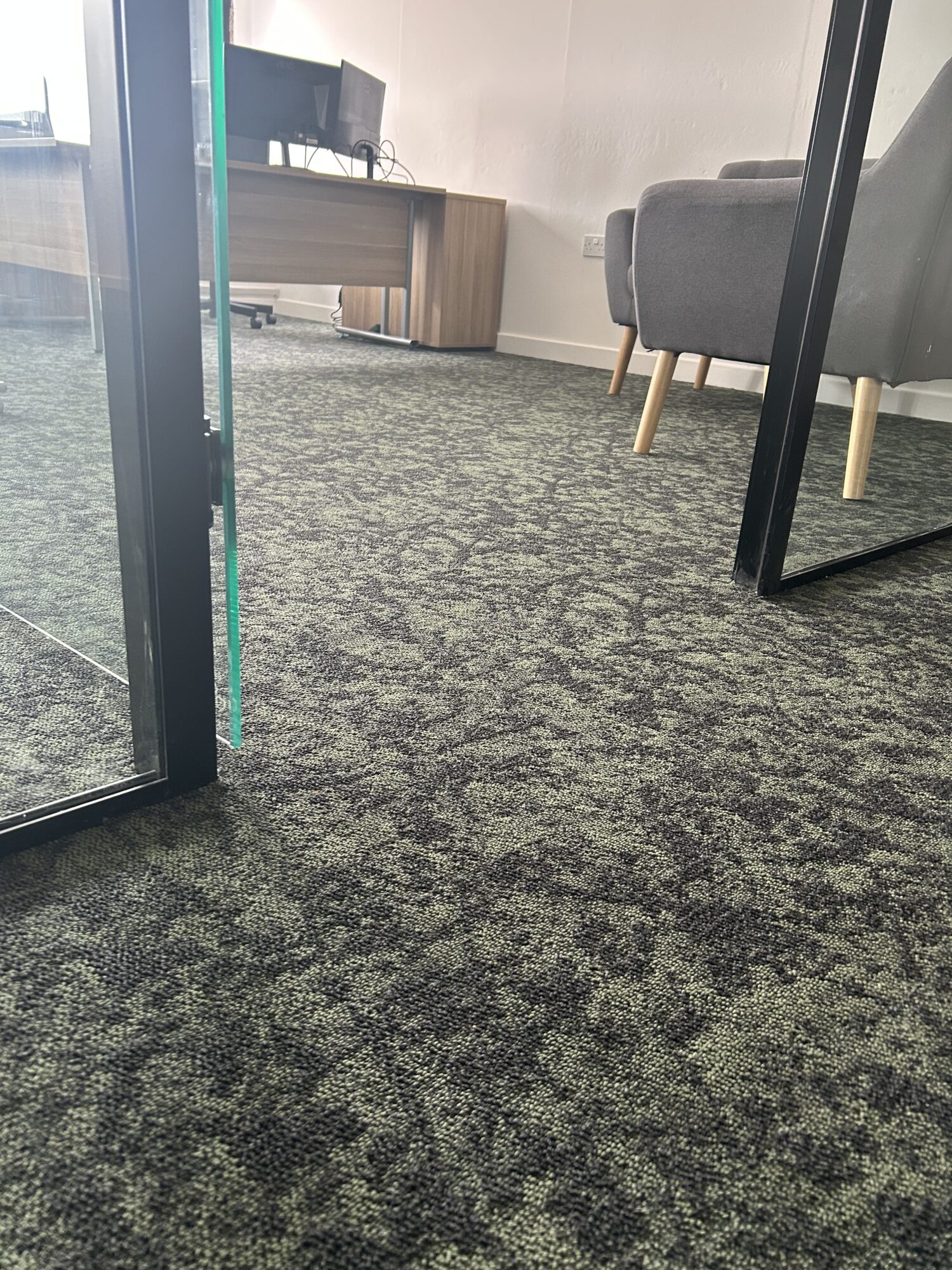
- Example Range: The Lifespace Venetian Charm in the shade Moss Green is a great way to bring an earthy feel to your space. For budget conscious jobs the Lifespace Elemental Loop range in the shade Racing Green gives that lighter tone, ideal for the Education sector and spaces requiring a pop of colour. See example below:
3. Neutral and beige carpet tiles – warmth and comfort
While grey carpet tiles dominate modern spaces, neutrals like beige, taupe, or cream offer warmth. These tones can make large open spaces feel inviting and less sterile.
- Benefits: Cozy atmosphere; blends seamlessly with traditional designs; hides dust effectively.
- Where to use: Healthcare facilities, hospitality, residential-style offices. Be mindful that lighter carpet tiles can pick up more dirt!
4. Bold and bright carpet tiles – energy and zoning
Sometimes you want flooring to make a statement. Bright carpet tiles in red, yellow, or orange can inject energy into a space and help with wayfinding or zoning in large buildings.
- Benefits: Stimulates energy and creativity; provides visual zoning; reinforces brand identity.
- Where to use: Reception areas, breakout spaces, schools.
- Example Range: The Lifespace Elemental Loop range in the shade Racing Green is a great example of how a pop of colour can make a statement.

Carpet tile colour by sector
Different environments require different approaches to colour selection. Here’s how shades perform across sectors:
Offices
- Grey carpet tiles are perfect for professional, versatile office design. They can be paired with accent colours for breakout areas.
- Blue tones enhance focus in meeting rooms.
- Bright tiles can designate collaboration zones.
Education
- Durable and affordable, grey carpet tiles hide wear in busy corridors.
- Bright tiles help create fun, engaging classrooms.
- Green tones work well in libraries to promote calm study.
Healthcare
- Grey carpet tiles maintain a clean, modern look without feeling cold.
- Blue and green tiles promote calmness in waiting rooms.
- Neutral tones enhance a sense of comfort in patient areas.
Hospitality & Retail
- Grey carpet tiles serve as a flexible base for changing décor trends.
- Bold colours can create memorable first impressions in lobbies.
- Neutrals provide a timeless background for displays and furniture.
Practical considerations beyond colour
While aesthetics matter, colour should be considered alongside other functional aspects of carpet tile selection:
- Maintenance – Mid-tone tiles (like grey carpet tiles) hide dirt well. Lighter shades may show spills quickly.
- Traffic levels – Darker colours often work better in high-traffic zones.
- Acoustics – Carpet tiles already reduce sound, but denser, darker tiles can absorb more.
- Longevity – Neutral bases like grey carpet tiles remain in style longer than trend colours.
Lifespace Flooring Ranges
At Lifespace, we provide a wide selection of colours and textures suitable for every sector. Our ranges include:
- Modern Edge – Sleek, professional designs in greys and blues.
- Elemental Loop – Durable, versatile tiles.
- Urban Inline – Ideal for zoning.
- Venetian Charm – A bold high-end design to elevate your commercial space.
Each range is designed to balance affordability with quality, ensuring you get the best results without exceeding your budget.
Final thoughts
Choosing the right carpet tile colour is more than just a design decision—it’s about functionality, mood, and long-term practicality. Grey carpet tiles continue to be a go-to solution thanks to their versatility, durability, and modern appeal. However, incorporating other colours—whether calming blues, refreshing greens, warm neutrals, or energising brights—can elevate your space even further.
By considering the type of environment, the mood you want to create, and the practical needs of your space, you can select a flooring colour that enhances both aesthetics and performance.
FAQs
Q1: Why are grey carpet tiles so popular?
Grey carpet tiles are versatile, modern, and practical. They hide dirt well, match almost any décor, and remain stylish over time.
Q2: Are bright carpet tiles suitable for offices?
Yes, especially for creative zones or breakout spaces. Bright tiles help with visual zoning and can stimulate energy and creativity.
Q3: Which colours are best for schools?
Grey carpet tiles are durable for corridors and classrooms, while bright colours can create a fun, engaging atmosphere for younger students.
Q4: What colours work best in healthcare?
Greys, blues, and greens are ideal as they convey calmness, cleanliness, and comfort. Some healthcare providers go for red carpet tiles in communal areas to bring brightness into the space.
Q5: Do lighter carpet tiles stain easily?
Yes, lighter shades can show spills and dirt more quickly. Mid-tone options like grey carpet tiles are a great compromise.Q6: Can I mix and match carpet tile colours?
Absolutely. Many designers use a combination of grey carpet tiles with bright or bold tiles to create zoning or unique patterns.